
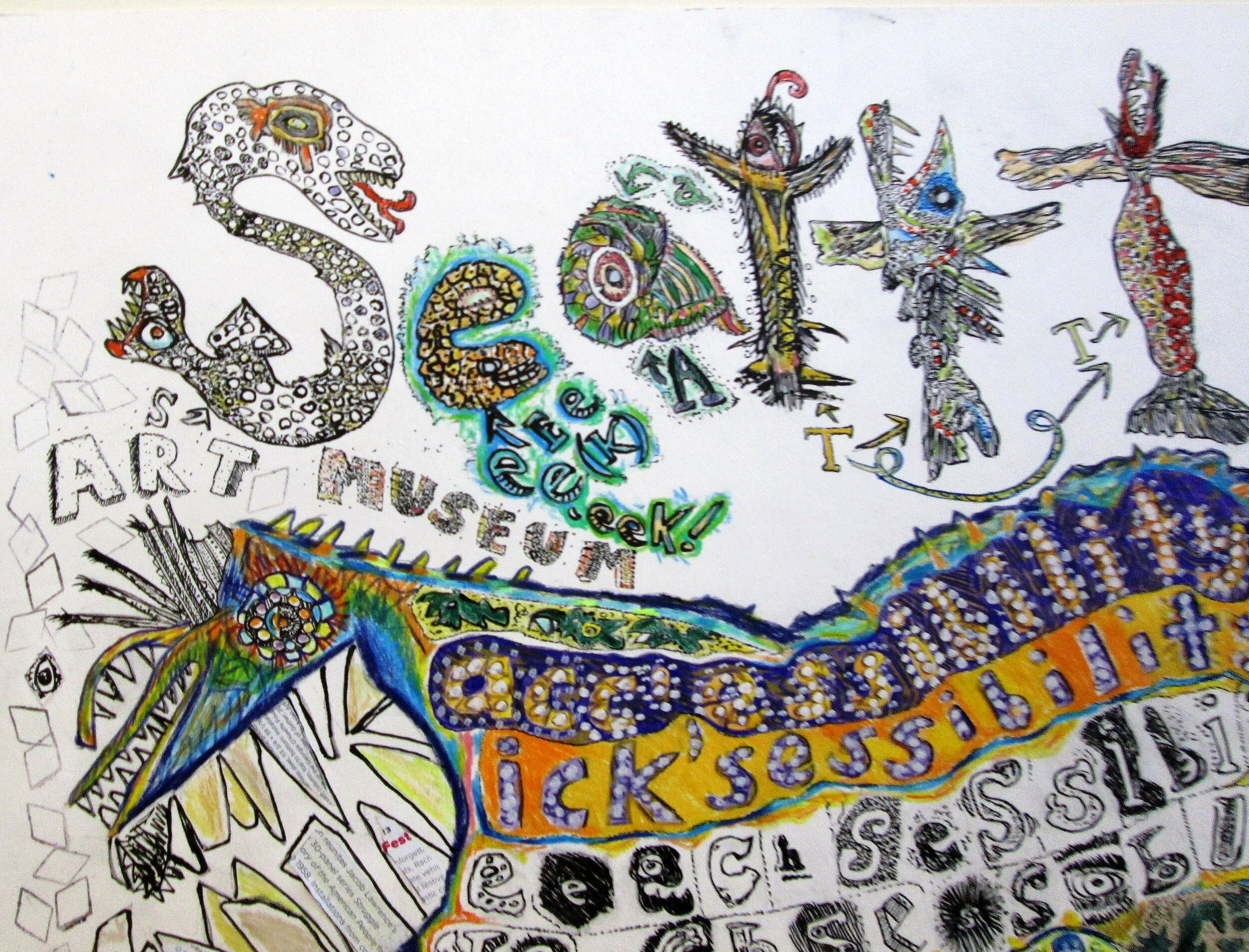
Art, video © A K Segan
SWD 42
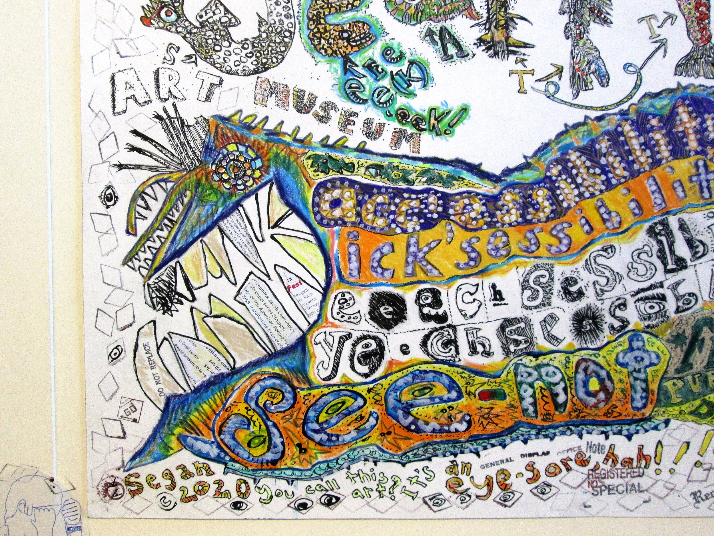
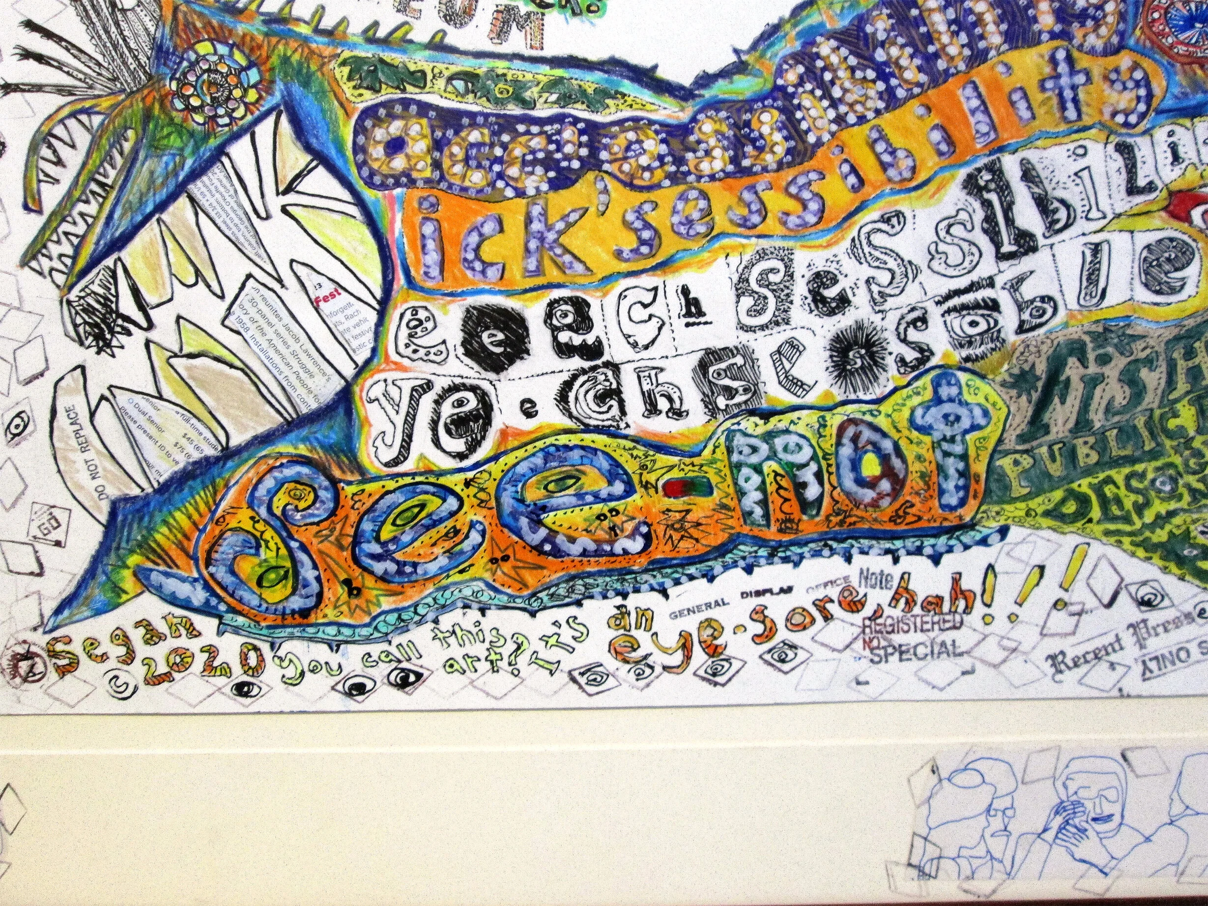
SeatttLe ART MUSEUM yeeech'sessibility see-not fishy publication-design see-beast!
Framed, 25 1/8 in. H x 31 1/8 W
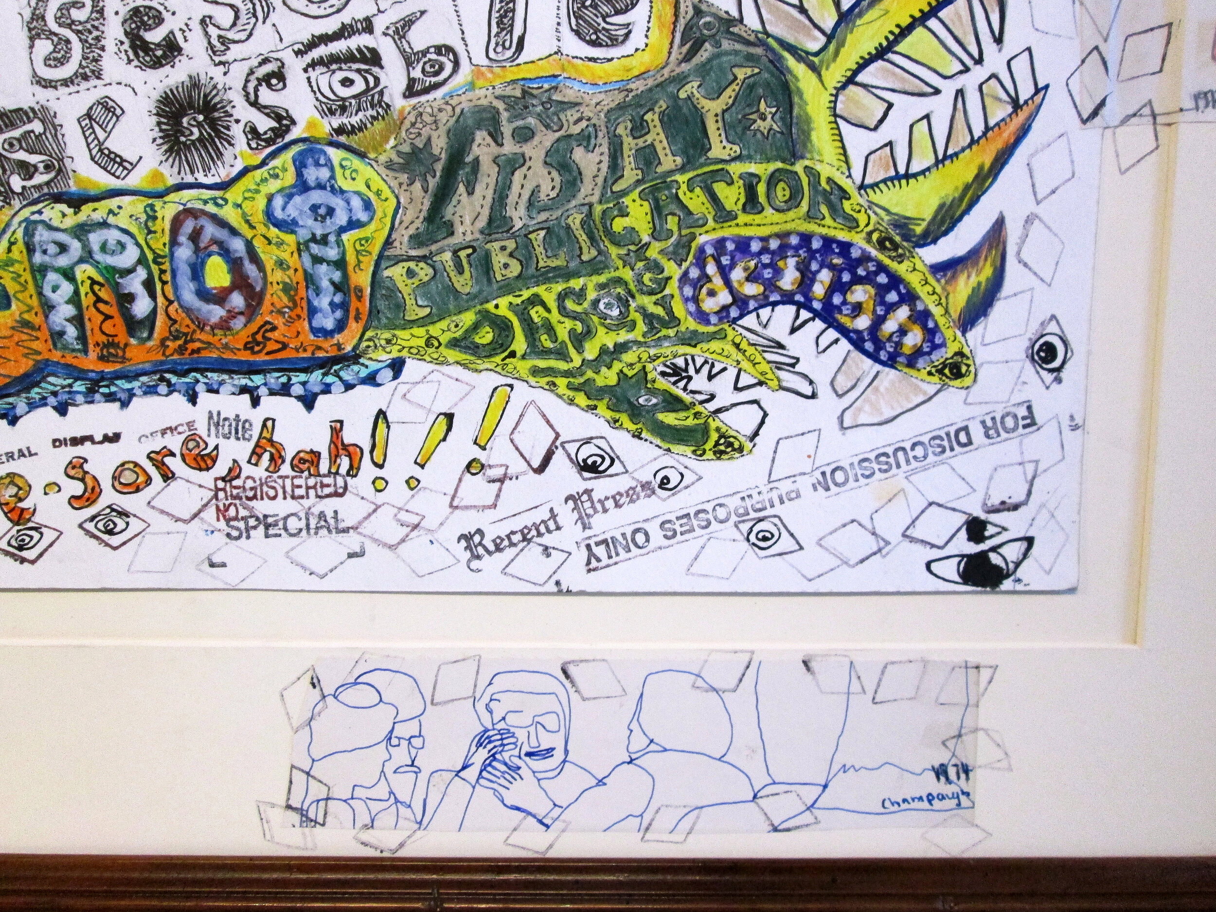
Media: pencil, gouache, colored pencil, India ink and blue drawing ink. Pieces of pages from a 2020 Seattle Art Museum program booklet and from a Seattle Symphony performance schedule booklet are collaged on 6 of the teeth of the see-beast. Rubber stampings are on the left and right sides and along the bottom; eyes drawn in India ink were drawn inside some of those stampings. Three sketches I did when I was a freshman art major in college, in Champaign, Illinois, 1973 and 1974,
are collaged onto the mat at bottom and right. A pencil sketch I drew sometime since 2000 is collaged on the mat, at top.
This is a parody of the type-font and text of the Seattle Art Museum’s hardcopy publications graphic designs, e.g. membership forms; brochures the schedule of exhibits, speakers and other programs; forthcoming exhibit announcement postcards. Even their larger-type gallery guide handout (at the museum) and seasonal schedule of exhibits, programs, etc., are not designed in readable, accessible, optometry-approved type for human vision and eye health as the museum doesn’t publish their larger-type materials with black, high-contrast, bold type. That defeats the use of common-sense fundamentals of graphic design.
Despite years of complaints by the public, most especially by older museum goers, the museum curators, education and marketing staff continue to approve the design and publication of hardcopy materials in extremely hard-to-read, very inaccessible non- black, high-contrast and non-bold type-font and text. And the SAM website is comparably poorly designed with lots of gray font.
The SAM website shows all subheading text words in light-value, gray font. This defeats the internet, reading and accessibility. The internet was designed as a visual communications medium.
The use of light-value type on the internet is not approved by any optometrists. Any optometrist will confirm that there are no prescriptions for corrective eye-wear for any light-value, extremely light-value, low-contrast and nearly-zero contrast type. This poor graphic design is now prevalent throughout the internet all thanks to Microsoft and their subdivisions, e.g. Linkedin, and then embraced by internet giants Facebook and their subdivisions, and Google and their subdivisions and followers of poor, needlessly eye-disease promoting graphic design.
~
A Youtube posted video of the completed drawing:
(5 min., 57 sec)
https://www.youtube.com/watch?v=mjRYk4euflI
~
In summer 2020 I received a letter from the Seattle Art Museum; the unsigned letter writer wrote that I am "low vision," and the letter writer said I should ask for them to send a large type program booklet in the future. (They evidently didn’t put my name and address in a list of those as the next program brochure I received was not in the larger size type they wrote I should ask for).
That aside, I have normal vision, according to optometrists.
This begs the question of why the museum staff choose to disenfranchise such a huge swath of the public. In the United States there are at least 160 million people wear corrective eyewear (eyeglasses or contact lenses). There are no prescriptions for corrective eye-wear for reading light-value type in both websites and hardcopy publications. Any optometrist will confirm.
The Seattle Art Museum’s ongoing use of non-black, non-high-contrast and non-bold type in their website and in their hard-copy publications ends up driving away visitors. It lessens the numbers of new and renewed memberships; and lessens the likelihood of both monetary and art bequests to the museum.
In only one area has SAM chosen to make any graphic design improvement in recent years: A few years back they began using black, high-contrast type in their exhibit label copy signage. That is great. They could use that model for all of their hardcopy publication design and for their website.
~
In my website, see SWD 40 and 41 in the Sight-seeing with Dignity human rights art series gallery; videos are posted to Youtube too:
SWD 41: The BeeBC glaucoma Puddin' Pie Lardy Cakes; SWD 40: The New York T(eye)mes Cataractios


Tags, keywords on public health, eye health, vision health, eye diseases:
Videos cataracts; videos glaucoma; videos macular degeneration; videos corneal diseases; videos glare website design; videos contrast sensitivity; videos vision loss from low-contrast type; videos eye dieases from low value low contrast type; videos vision harmful website design; videos vision harmful websites graphic design; videos Google accessibility; videos Youtube accessibility; videos US SENATE COMMITTEE on Health Education Labor and Pensions; videos US SENATE COMMITTEE on Health Education Labor and Pensions; United States House Oversight Subcommittee on Health Care, Benefits, and Administrative Rules; videos United States House Oversight Subcommittee on Health Care, Benefits, and Administrative Rules; glare; disability glare; cataracts; glaucoma; macular degeneration; stereopsis; corneal diseases; keratoconus; glare testing; glare devices; contrast sensitivity; visual acuity; mesopic; photopic; cataracts; vision loss from low-contrast type; vision loss from light-value type; eye diseases from light value type; eye diseases from low-contrast type; vision harmful graphic design; vision harmful internet website design; Facebook graphic design; Facebook accessibility; videos Facebook graphic design; videos Facebook accessibility; preventing blindness; videos preventing blindness; videos glare website design; videos cataracts and website design; videos glaucoma website graphic design; videos contrast sensitivity website design; videos vision loss low contrast type graphic design; videos visual acuity website design; Google graphic design; Google accessibility; videos Google graphic design; videos Google accessibility; The New York Times accessibility; videos The New York Times accessibility; Seattle Art Museum accessibility; Frye Art Museum accessibility; videos Seattle Art Museum accessibility; BBC accessibility; videos BBC accessibility; parody satire museum graphic design; parody satire Seattle Art Museum accessibility; videos parody satire museum graphic design accessibility